I just always find myself returning to this little fakemon project every so often–it’s been a wonderful little side project. This time I went a little further, though–I redrew all the fakemon I had designed so far, added some new ones, and compiled them into a little zine (which is currently available for preorder!). The reason I redrew them was because trying to imitate the official style of Pokemon was proving hard for me, and I think stifling a bit of my creativity with the designs. I changed it to a more flat style for me to continuing drawing and designing these mons in a way that felt better. I did certainly learn a lot, though, when trying to copy the official style, and using the same poses as the official art gave me a better feel for Pokemon design.
So this post is a bit of a retread–I’m gonna go over all the fakemon I’ve already showcased in previous blogs, and the next post will go over all the new mons I made. Because when I redrew them, I also ended up redesigning a lot of the mons to something closer to what I had initially wanted.
If you haven’t already, before going on I suggest checking out these old posts, because they still have the info and dex entries on the mons which haven’t changed, even if the design has. The first is here, the second is here, and the third is here.
Let’s start with… who else, the starters?
The Trilobud Line
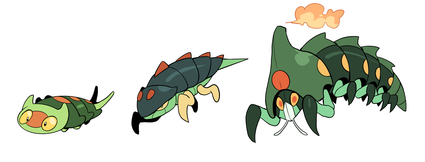 It makes me happy to hear this is one of the favourite of the starter lines–poor Grass always kinda gets left behind, and I thought the Grass line being bugs would only make that worse. But how can you say no to little Trilobud? That’s why I didn’t change much–mostly a few tweaks with its tail to give it some cool trilobite spines. Eurypterra and Anthromotive are another story, though–they went through quite the overhaul! I made Eurypterra look more like its namesake–giving it a more sinister, sea scorpion appearance, and Arthromotive I felt was close with its first design, but needed some better shapes and forms to make it more bug-like.
Some of these mons I can just imagine animated as a 3D model, such as Arthromotive. I see its segments and legs always moving to make it look like a moving train.
The Dimwick Line
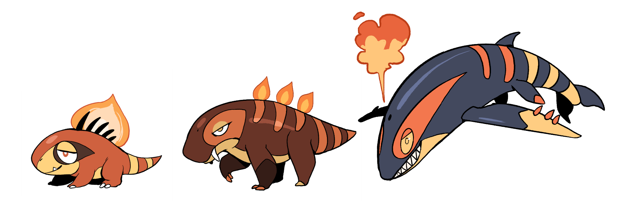
Yes, that’s a new name! “Embrodon” felt like a pretty lackluster name, especially for a starter, so I eventually settled on Dimwick because it was cuter. It also got a pretty big redesign! I simplified it a little, and added little wick spines on its back. Pyrapsid and Baseppelin are pretty much the same, though, aside from some changes to the fire on Pyrapsid’s back.
The Sliktaalik Line
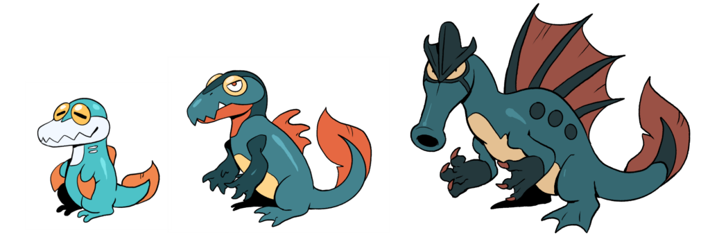
The final starter line! Sliktaalik itself also got a pretty big redesign–my problem with it before was it looked too much just like a Water Charmander. I made Sliktaalik’s head shaped more like an actual Tiktaalik. Nothocean got the same treatment, I referenced Nothosaurs for a better head shape. Spyrate didn’t change much at all, aside from a slight name difference (Ys just feel cooler, you know?). It was definitely one of those designs I didn’t change much from the first sketch, it just worked from the get-go.
The Zapling and Sewadillo Lines
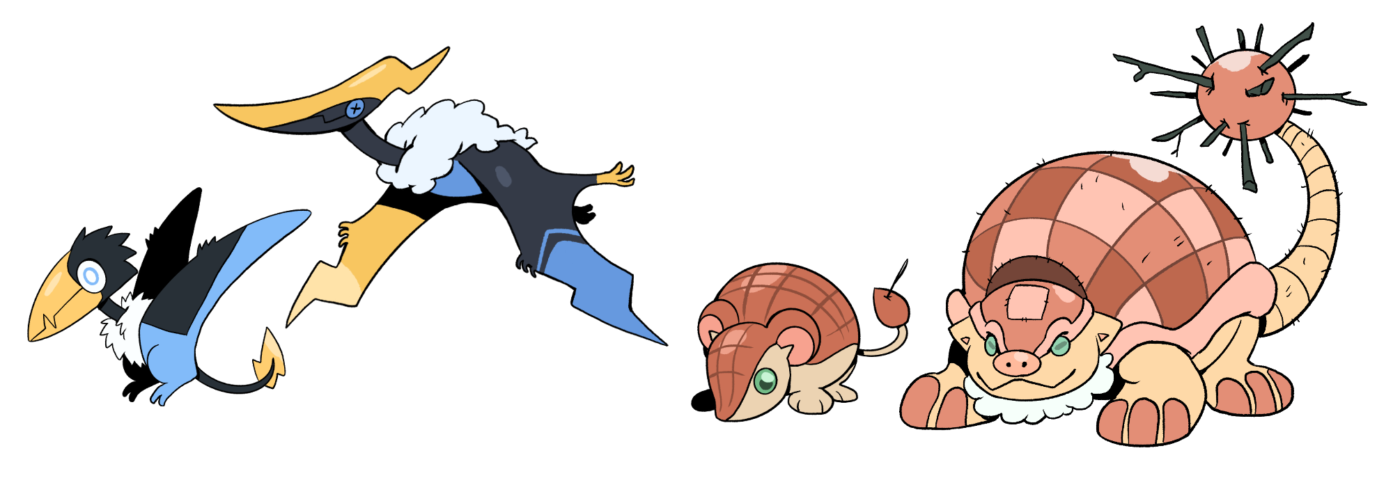
The “early” lines of the dex. Zapling and Pteranimbus didn’t change much at all–in fact I even pretty much just redrew their same poses and everything (I ended up doing that for a few mons, too, just to translate them to the new style). Sewadillo and Glyptoquilt, though, got more of an overhaul. I wanted to make the pin cushion aspect more prominent for Sewadillo, while also making Glyptoquilt’s tail look like its full of sticks instead of actual needles–I wanted to make it seem a bit more… natural, I guess? Instead of purely stuffed animals. It is obviously supposed to resemble needles, but now it at least feels like it could be an actual “animal”, in a sense. Pokemon has always been pretty good at that–as fantastical as their creatures can be, there’s still always some grounded logic to them that lets you believe this is a real creature in this world, even if it’s a metallic eyeball or a pile of garbage. In this case, the two ‘dillos look like they could be stuffed, but also living animals.
Helixugenia and the Forgossil Line
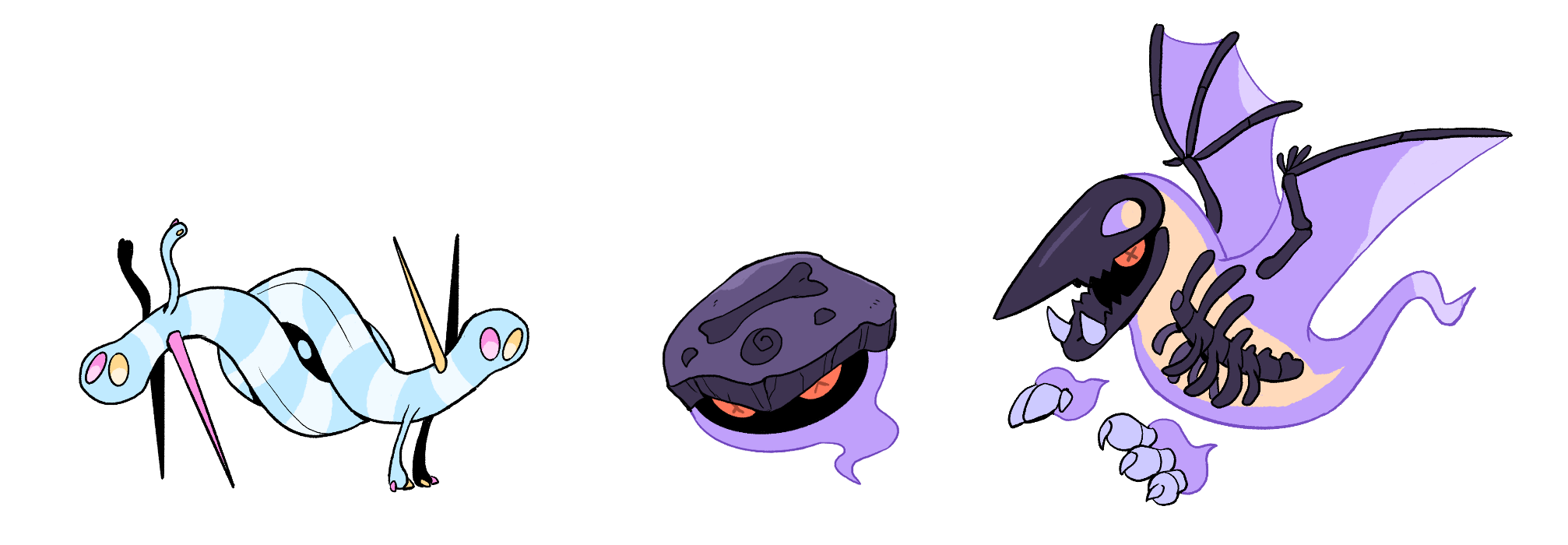
We’re skipping ahead a little here, because these are the last guys that had any big redesigns. Helixugenia got some tweaks, but Forgossil and Phantaxon got the bigger overhaul. I’m pretty happy with these two, making them look a bit more like ambiguous ghost-like creatures. Forgossil with the little fossil “hat” makes me think it could be a funny overworld mimic, sort of like Voltorb. And a cool detail with this Phantaxon design, which I need to draw some day, is when it closes its skull “mouth”, its true eye appears in the eye hole of the skull!
The rest!
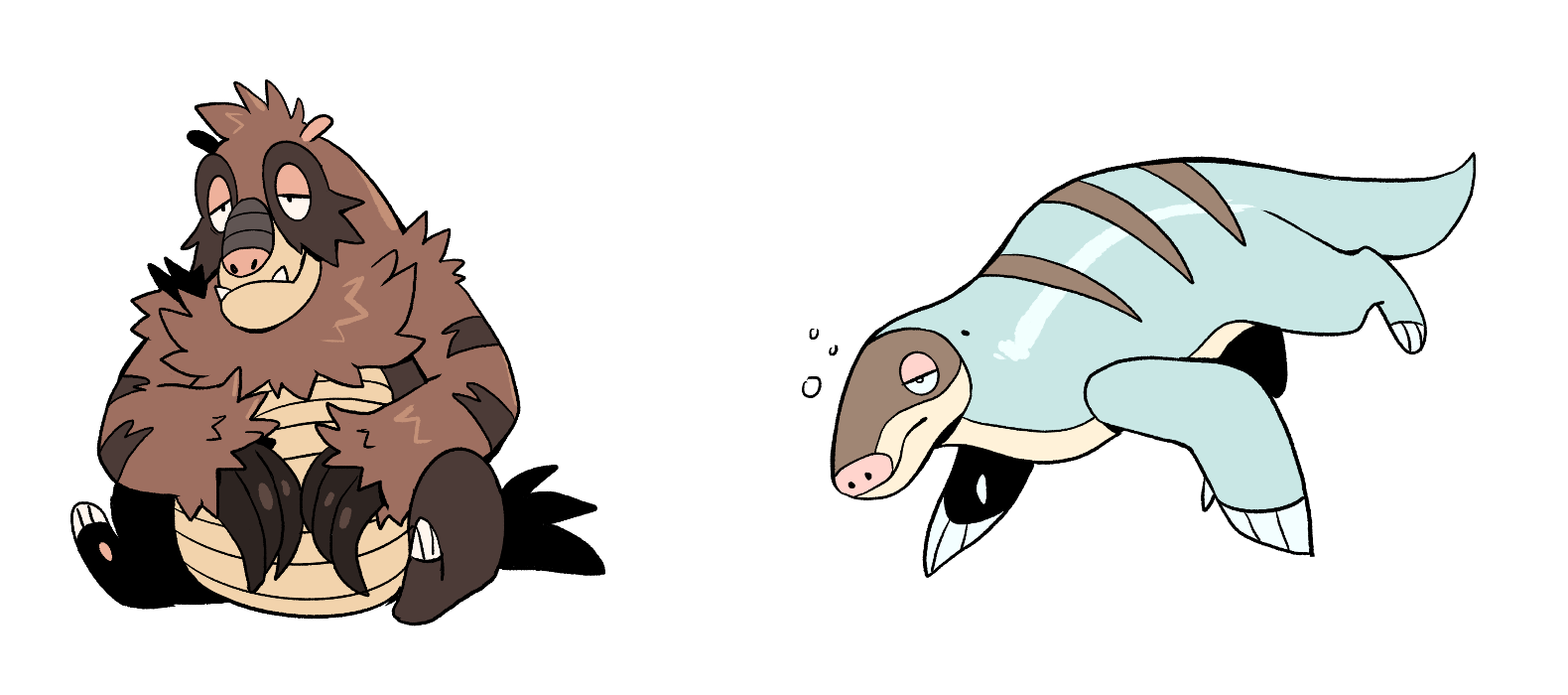
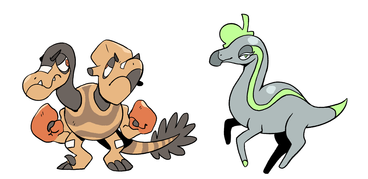
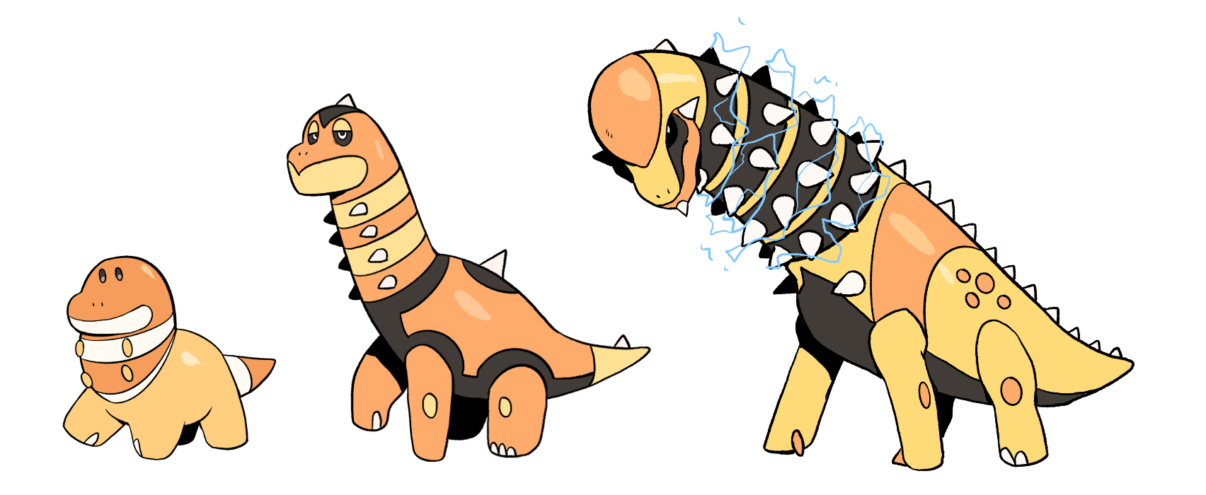
The remaining mons didn’t get a big redesign, but I still ended up redrawing them, so enjoy the updated art!
The Archen and Rhyhorn lines

The Eeveelution Line
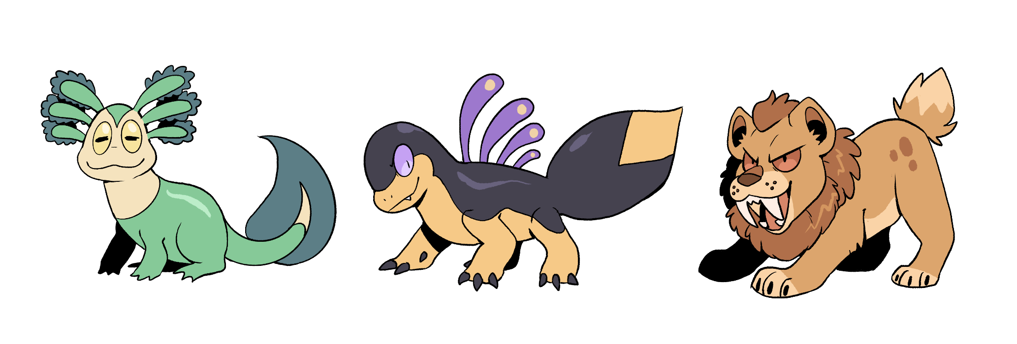
Aerodactyl and the Anorith line
 Diggoroth and Thalasskoth
Velocerate and Saurophonic
The Poddlet Line
 Irideorite and Vertebraia
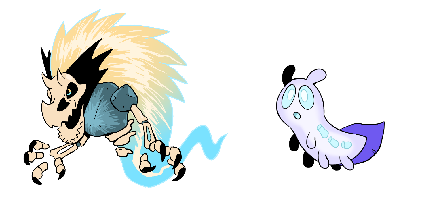
I’m not usually the type to go back on my projects and redraw things, I’m much more of a “just keep on trucking” type, but I was just… compelled, with this one. Now it feels much more of “my own” in a sense, rather than trying to imitate actual Pokemon.
The next post will be all the new fakemon I made for the zine and this region! I’m excited to show them off!
